
Last Updated: June 2026 | Reading Time: 10 minutes
How AI Transforms Data Visualization
Traditional visualization tools require users to know what they want to see before creating it. You select chart types, define axes, filter data, and arrange dashboards manually. This assumes analytical foresight—that you already know which patterns matter, which comparisons reveal insights, and which metrics deserve monitoring.
AI visualization flips this sequence. Upload a dataset and the system suggests relevant chart types automatically. Ask “What drives customer churn?” and receive generated visualizations highlighting predictive factors. Request anomaly detection and watch the system flag unusual data points across time series, geographic maps, or scatter plots without explicit threshold definitions.
Natural language interfaces eliminate the gap between business questions and visual answers. Conversational exploration lets users drill down from high-level summaries into granular details through dialogue rather than menu navigation. Predictive overlays extend charts from historical reporting into future forecasting, showing projected trends alongside actual values with confidence intervals.
This transformation matters because it democratizes visual analytics. Domain experts without design training or query language skills access sophisticated visual insights. Analysts spend less time constructing charts and more time interpreting findings. Decision-makers receive proactive alerts when visualized metrics shift unexpectedly, rather than discovering changes during scheduled report reviews.
Comparison Framework
Evaluating AI visualization tools requires examining multiple dimensions beyond headline AI claims.
Automation Depth
Some tools automate chart selection based on data types—recommending bar charts for categories, line charts for time series, and scatter plots for correlations. Others automate insight extraction, explaining why specific data points matter, what trends indicate, and how metrics relate causally. Deeper automation reduces analytical burden but may obscure reasoning users need to trust.
Interactivity and Exploration
Static AI-generated charts deliver limited value. Rich interactivity—hover details, drill-down paths, cross-filtering, parameter adjustments—lets users interrogate AI suggestions rather than passively accepting them. Tools vary enormously in interactive sophistication.
Customization Control
AI suggestions speed initial creation, but final deliverables often require precise formatting, branded styling, and specific annotation. Tools that balance AI help with detailed manual control can be used in more situations than those that force you to choose between full automation and manual construction.
Data Scale and Performance
Client-side rendering in browsers handles thousands of rows adequately. Millions or billions of rows demand server-side aggregation, database pushdown, or specialized rendering engines. Enterprise-scale visualization requires different architecture than personal analytics.
Ecosystem Integration
Visualization exists within broader workflows. Embedding in applications, connecting to live data sources, exporting to presentations, and triggering automated actions separate useful tools from isolated novelties.
| Dimension | Why It Matters | Evaluation Approach |
|---|---|---|
| Automation depth | Determines analytical burden reduction | Does it suggest charts, explain insights, or predict trends? |
| Interactivity | Enables user-driven exploration | Can users drill, filter, and cross-highlight dynamically? |
| Customization | Supports branded, precise deliverables | How granular are color, font, layout, and annotation controls? |
| Data scale | Limits practical application scope | At what row count does performance degrade? |
| Integration | Determines workflow value | Can it embed, connect live, export, and trigger actions? |
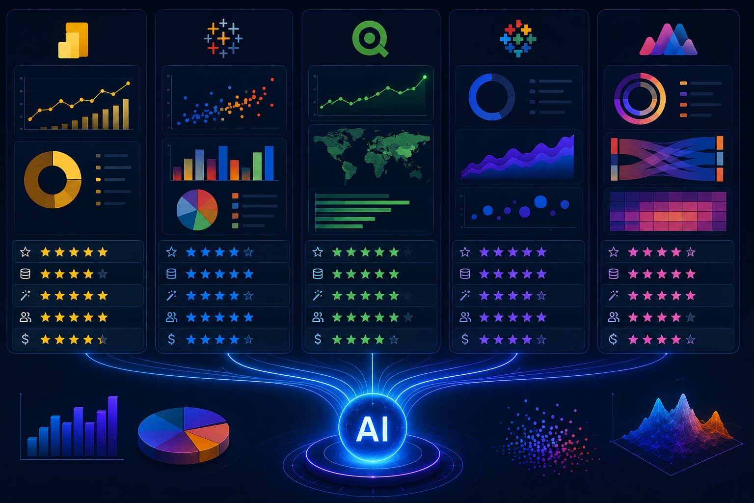
Enterprise Leaders: Tableau and Power BI
Established business intelligence platforms have integrated AI features extensively, leveraging existing market presence and enterprise relationships.
Tableau
Tableau’s visual excellence extends into AI through Tableau Pulse and Ask Data. Ask Data allows natural language queries against published data sources, generating visualizations from conversational inputs. Users type “Show me sales by region over time” and receive appropriate line charts with regional breakdowns. The system interprets intent, maps terms to data fields, and suggests refinements when ambiguity exists.
Tableau Pulse monitors metrics continuously, surfacing trends and anomalies through personalized feeds rather than requiring users to open dashboards. AI-generated explanations accompany visualizations, describing what changed and potential contributing factors in natural language. Einstein Discovery integration brings predictive capabilities, overlaying forecast ranges and segment explanations onto traditional charts.
Explain Data, another AI feature, lets users select any data point and receive automatically generated explanations of contributing factors. Click an unusually high sales bar and see which products, customer segments, and regions drove the spike. This contextual explanation transforms visualization from display into analysis.
Strengths include unmatched visual refinement, extensive enterprise features, and mature AI integration that feels native rather than bolted-on. Weaknesses include cost escalation for AI features, learning curve for advanced interactivity, and performance limitations with extremely large datasets without data extracts.
Microsoft Power BI
Power BI integrates Microsoft’s broader AI ecosystem deeply. Quick Insights analyzes datasets automatically, generating dozens of visualizations highlighting trends, correlations, and outliers. Users select datasets and receive suggested charts without specifying what to examine. Decomposition trees enable interactive exploration of metric drivers, with AI suggesting likely explanatory variables at each branch.
Key influencers’ visualization identifies factors most strongly affecting outcomes, presenting results as intuitive ranking charts with explanatory text. AI-powered Q&A allows natural language querying with conversational refinement. Copilot integration, expanding throughout 2025-2026, generates entire report pages from natural language descriptions, complete with appropriate visualizations and formatting.
Azure Machine Learning integration enables custom model deployment within Power BI. Predictions from trained models appear as visualized metrics alongside historical data. This bridges the gap between specialized data science and general business consumption.
Strengths include aggressive pricing, Microsoft ecosystem integration, and rapidly maturing AI features. Weaknesses include visual sophistication trailing Tableau, performance complexity with large models, and AI features sometimes feeling distributed across multiple interfaces rather than unified.
| Feature | Tableau | Power BI |
|---|---|---|
| Natural language querying | Ask Data | Q&A + Copilot |
| Automated insights | Tableau Pulse | Quick Insights |
| Predictive overlay | Einstein Discovery | Azure ML integration |
| Point explanation | Explain Data | Decomposition tree |
| Visual quality | Industry-leading | Adequate, improving |
| Pricing entry point | $75/user/month | $10/user/month |
Cloud-Native Platforms: Google Looker and Domo
Newer platforms architected for cloud scale offer distinct AI visualization approaches.
Google Looker
Looker’s semantic modeling layer separates data definitions from visualization construction. AI features leverage this architecture for consistent, governed analytics. Looker Studio provides the visualization front end with AI-powered data exploration. BigQuery ML integration enables predictive metrics that visualize directly alongside historical data without data movement.
Natural language querying through Looker Studio allows conversational exploration of modeled data. The semantic layer ensures terminology consistency—”active user” means the same thing whether queried by an executive or analyst, preventing the definition drift that plagues ad-hoc visualization.
Auto-generated dashboards from data source scanning suggest relevant visualizations based on detected schemas. This accelerates initial deployment, though curated refinement remains necessary for production-quality deliverables.
Strengths include cloud scalability, semantic governance, and tight BigQuery integration for massive datasets. Weaknesses include requiring a Google Cloud Platform commitment, less mature AI features compared to Tableau and Power BI, and a higher barrier to entry for individual users.
Domo
Domo’s AI visualization extends into workflow automation. Beyond generating charts, Domo.AI creates alerts triggering actions when visualized metrics cross thresholds. Narrative summaries accompany visualizations, explaining changes in business context. The platform’s distinctive strength is integrating visualization into operational workflows rather than treating it as terminal reporting.
Domo Bricks provide pre-built, AI-enhanced visual applications for specific functions. These combine visualization, prediction, and action in packaged solutions. Mobile visualization is particularly strong, with native apps providing full interactivity.
Strengths include workflow integration, mobile experience, and comprehensive platform breadth. Weaknesses include high cost, limited free tier, and complexity that may overwhelm users wanting pure visualization.
Developer-Focused Tools: Plotly and Observable
Technical users prefer code-first approaches offering unlimited customization and programmatic control.
Plotly Dash
Dash builds interactive web applications in Python, with AI integration through callback functions connecting to machine learning models. Users construct visualizations in code, then deploy as web applications. AI features come from underlying Python libraries—Scikit-learn for predictions, Statsmodels for statistical overlays, and TensorFlow for deep learning visualizations.
Dash Enterprise adds AI-specific components: automated chart suggestions from data frames, natural language query interfaces, and pre-built ML integration templates. This bridges code-first flexibility with enterprise AI features.
Strengths include unlimited customization, Python ecosystem access, and deployment flexibility. Weaknesses include requiring programming skills, longer development cycles, and infrastructure management for production deployment.
Observable
Observable pioneered reactive notebooks for data visualization, using JavaScript as the primary language. Cells react automatically when referenced data changes, creating fluid exploratory environments. AI integration comes through JavaScript libraries and API connections to external AI services.
The platform excels at rapid prototyping and public sharing. Notebooks publish as interactive documents readers can modify and explore. Community notebooks demonstrate sophisticated AI visualizations others can adapt.
Strengths include reactivity, public sharing, and JavaScript ecosystem access. Weaknesses include JavaScript’s limited statistical library depth compared to Python and enterprise features less mature than established BI platforms.
No-Code AI Visualization: Julius AI and Akkio
Emerging tools target users wanting AI-generated charts without learning query languages or design principles.
Julius AI
Julius AI accepts spreadsheet uploads and generates visualizations from natural language descriptions. Users request “Show me monthly sales trends with anomaly highlighting” and receive interactive charts with explanatory text. The platform handles data cleaning, statistical testing, and chart selection automatically.
Export options include regenerated spreadsheets, presentation slides, and interactive dashboards. The conversational interface allows iterative refinement: “Now break this down by region” or “Add a forecast for next quarter.”
Strengths include extreme accessibility, narrative explanations, and rapid iteration. Weaknesses include limited customization control, smaller dataset limits than enterprise platforms, and dependency on cloud connectivity.
Akkio
Akkio focuses on predictive visualization specifically. Upload data, select prediction targets, and receive forecast visualizations with confidence intervals and driver explanations. The platform emphasizes business outcomes over exploratory analysis—lead scoring, churn prediction, and demand forecasting are visualized directly.
Strengths include guided predictive workflows and business-focused outputs. Weaknesses include narrower scope than general visualization tools and less flexibility for non-predictive use cases.
| Tool | Type | Best For | Skill Required | Free Tier |
|---|---|---|---|---|
| Tableau | Enterprise BI | Visual sophistication, governed analytics | Moderate | Tableau Public |
| Power BI | Enterprise BI | Microsoft ecosystem, cost efficiency | Low-Moderate | Desktop free |
| Google Looker | Cloud BI | BigQuery scale, semantic governance | Moderate-High | Looker Studio limited |
| Domo | Business cloud | Workflow integration, mobile | Low-Moderate | None |
| Plotly Dash | Code-first | Custom applications, Python integration | Programming | Open source |
| Observable | Code-first | Reactive notebooks, rapid prototyping | Programming | Public notebooks free |
| Julius AI | No-code AI | Conversational exploration, accessibility | Minimal | Limited uploads |
| Akkio | No-code AI | Predictive visualization, business outcomes | Minimal | Trial available |
Selection Guidance by Use Case
Specific scenarios favor specific tools.
Enterprise reporting with governance: Tableau or Power BI. Mature AI features, extensive connectors, and administrative controls support governed self-service at scale.
Cloud-native big data: Google Looker. BigQuery integration handles petabyte-scale visualization without performance degradation. Semantic layer ensures metric consistency.
Embedded analytics in applications: Plotly Dash or Power BI embedded. Programmatic control and deployment flexibility integrate visualizations into customer-facing products.
Rapid prototyping and exploration: Julius AI or Observable. Minimal setup enables immediate exploration without infrastructure investment.
Workflow-integrated operational analytics: Domo. Visualization triggers actions, not just informs decisions.
Microsoft-centric organizations: Power BI. Ecosystem integration reduces friction and licensing complexity.
Related Articles
- What Is AI-Powered Data Analytics for Beginners
- How AI Tools Summarize Large Datasets Instantly
- Best AI Dashboard Tools for Tracking Metrics
- How to Use AI for Spreadsheet Analysis
- How Small Businesses Can Use AI Analytics
Sources and References
- Gartner Research. (2026, March). Magic Quadrant for Analytics and Business Intelligence Platforms: AI-Enhanced Visualization Assessment. Gartner ID G00761234.
- Tableau Software. (2026). Tableau Pulse and Explain Data: AI Feature Technical Documentation. Salesforce Product Documentation.
- Microsoft Corporation. (2025). Power BI AI Visualizations: Quick Insights, Key Influencers, and Decomposition Trees. Microsoft Learn Platform.
- Google Cloud. (2026). Looker Studio and BigQuery ML: Predictive Visualization Architecture. Google Cloud Technical Whitepaper.
- Plotly Technologies. (2025). Dash Enterprise: AI Integration and Automated Chart Suggestions. Plotly Documentation.